Bridging design & development with a unified, scalable design system
My role
As the sole product design intern, I created and documented a design system from scratch, collaborating with the developer for a smooth handoff and the branding team to align on brand identity.
The company
Vouhn GmbH is an early-stage B2B SaaS startup in the industry of PropTech and facility management.
The team
Remote and in-person collaboration with product manager, engineering, branding, and sales teams.
Overview
Supporting thousands of properties with a single SaaS solution
Vouhn GmbH develops a property management platform for engineering offices in Germany. The platform replaces manual spreadsheets with a unified SaaS solution that enables multi-user collaboration and helps teams manage thousands of properties across multiple clients.
The challenge
Visual inconsistency across the platform
When I joined the project, the platform lacked visual consistency. Fonts, sizes, and spacing varied across screens, and branding colors were missing, making the interface feel fragmented and unpolished.
The goals
Building a flexible foundation for consistent design at scale
My main goal was to establish a unified visual language to help users familiarize themselves with the platform and quickly understand and navigate it, streamlining their workflows.
This unified language could only be achieved by developing a consistent and scalable design system that would help align design and development and make screen creation faster.

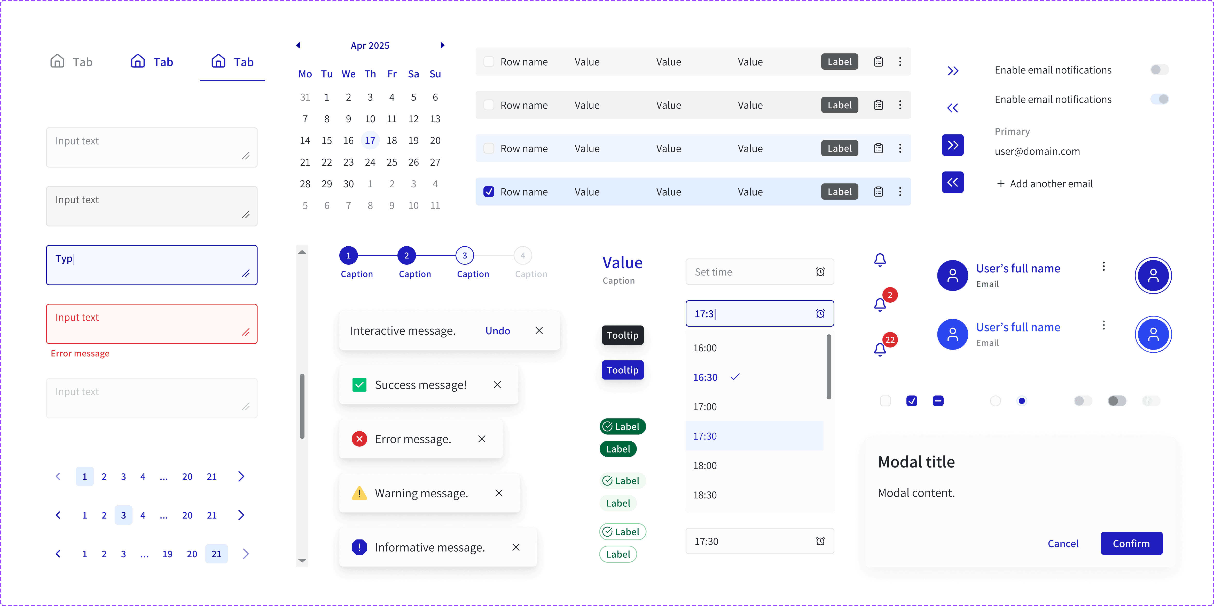
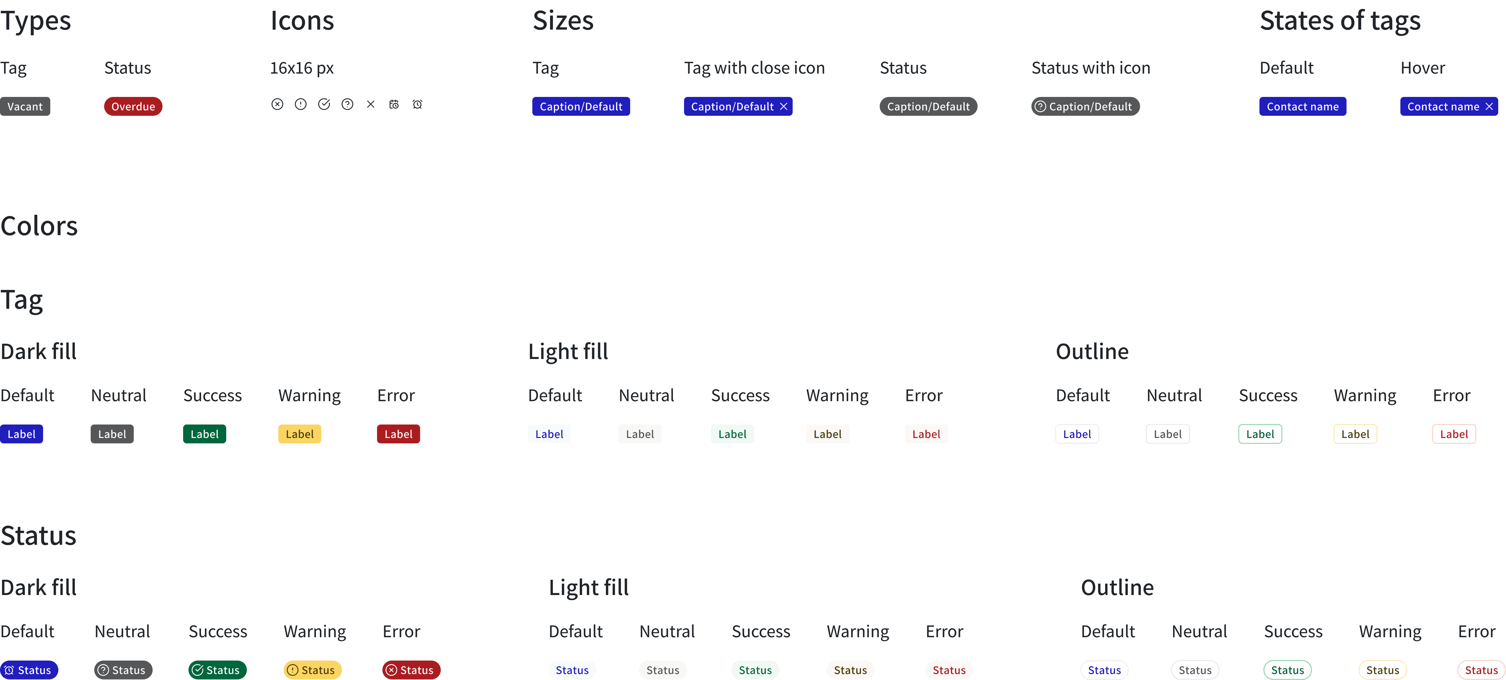
The design system
140+ components shaping a cohesive and scalable UI system
A comprehensive system that is built to grow
I built a complete design system with 140+ components and variables, covering color tokens, typography, spacing, shadows, corner radius, icons, and interaction patterns.
These tokens keep the design consistent across screens and create a solid foundation for future updates, like tablet and mobile layouts, dark mode, or new platform features.

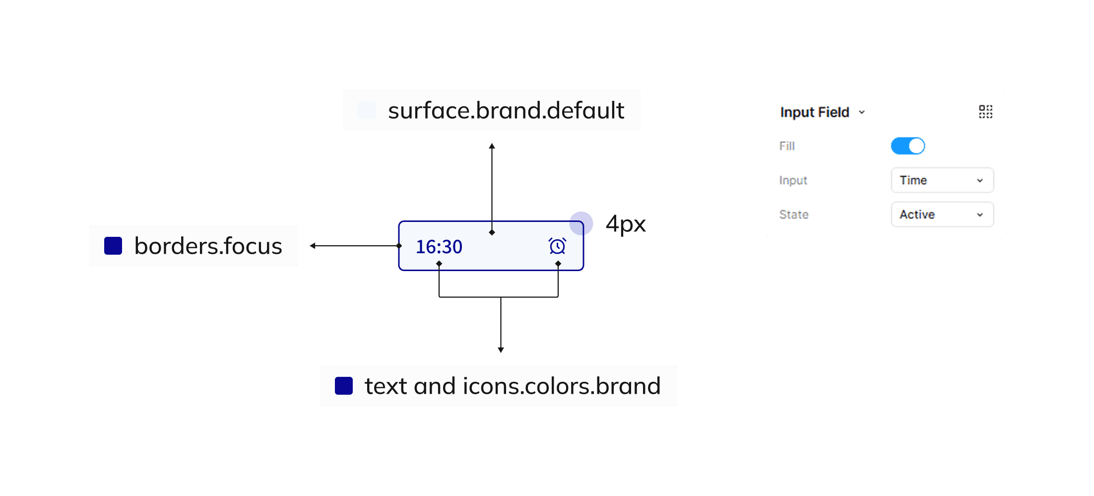
Clear component properties, naming conventions & scoped tokens
To streamline design and implementation, I created properties with intuitive names, toggle options, and icon instances, along with clear naming conventions based on size, type, state, appearance, and context.
I kept colors organized with scoped tokens that are tied to their exact use (like font colors), preventing usage mistakes and accelerating both design and development processes.
These improvements streamlined my workflow, reducing the average screen design time to 8-15 hours.

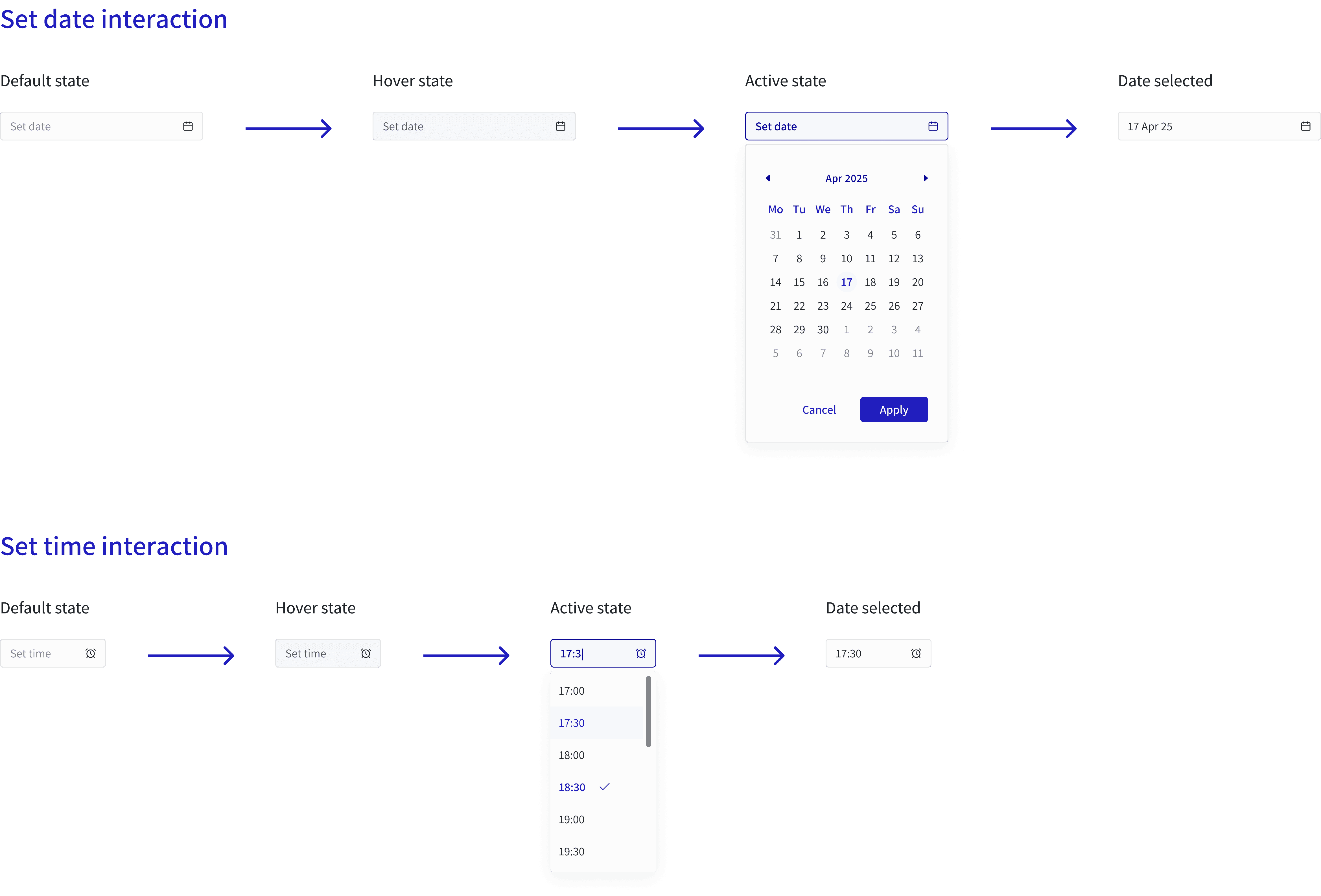
The design decisions
Designing for flexibility: spacing, grids, icons, and responsiveness

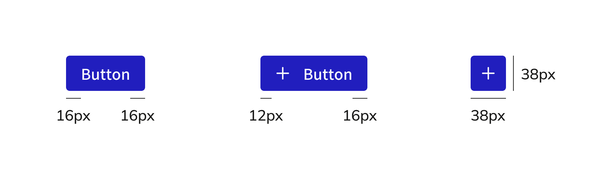
Flexible spacing system
I adopted an 8px spacing system, using 8px as the base and 4px as a half-step, since it provides greater flexibility and aligns with common design practices.
Spacing rules for visual harmony
I defined spacing rules for buttons and badges with and without icons, using uneven padding between icons and text to maintain visual balance and the illusion of symmetry, while keeping icon-only buttons at fixed width and height for consistency.

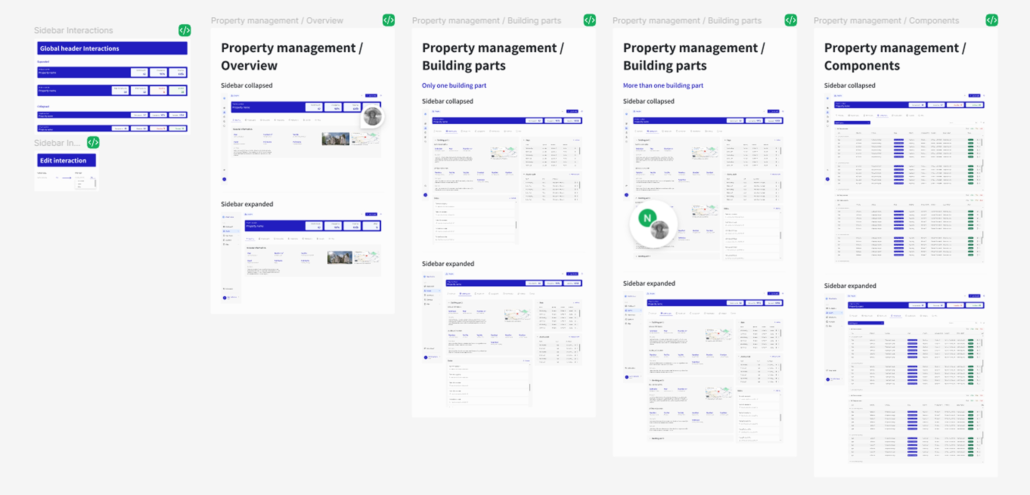
Smart grid layout
To avoid breaking the layout when the sidebar collapses, I applied the grid to the main panel only, allowing columns to expand without changing the number assigned to elements and keeping the layout consistent.
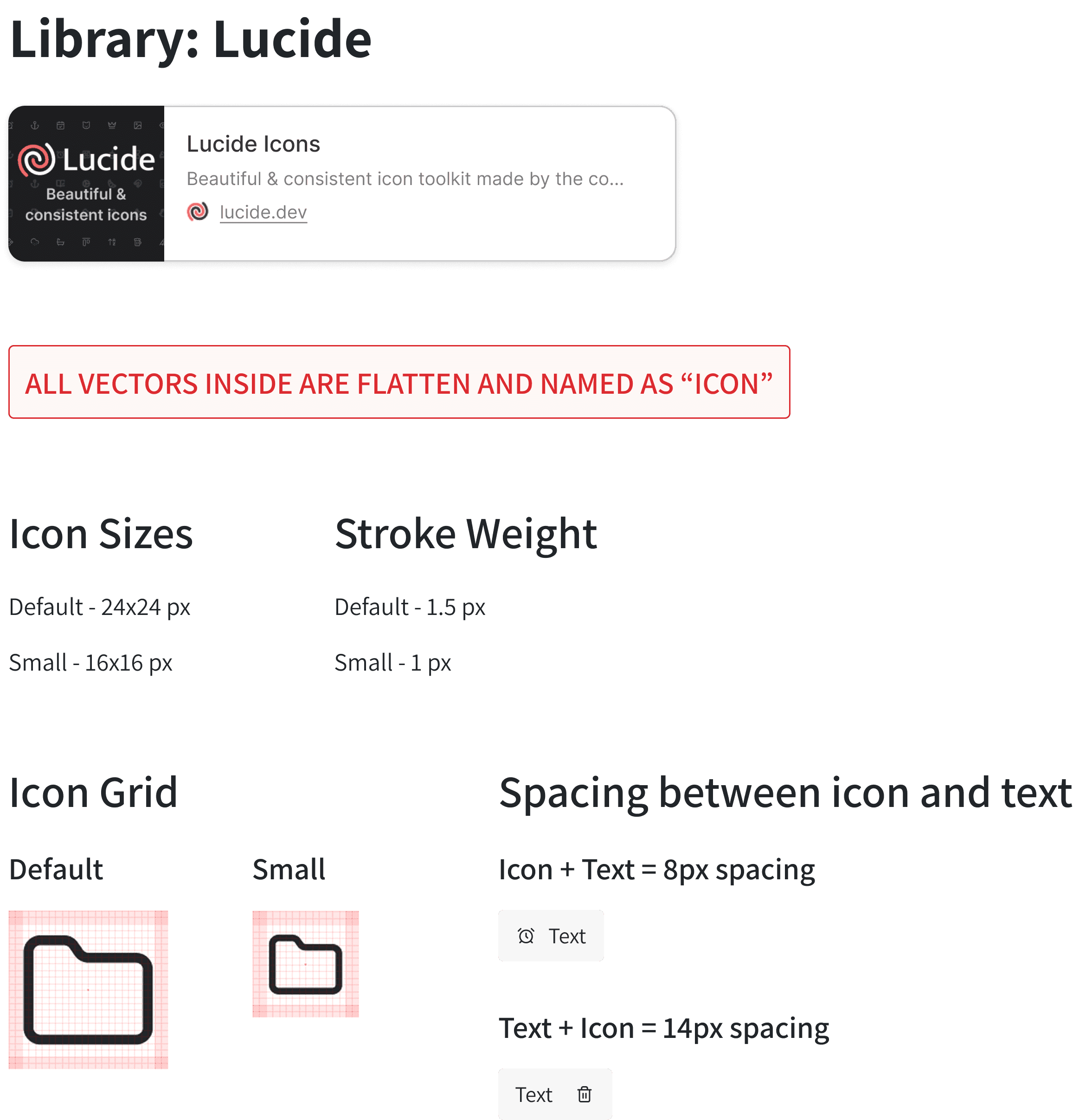
From mixed sources to one icon library
I initially used icons from multiple libraries without saving their original names. After clarifying requirements with the developer, I chose a single source library as the base to ensure proper licensing and consistency, building my own curated set and adding one custom icon to fill a gap.
I made some adjustments to the icons’ grid, stroke weight, and colors so they meet the icon standards I had defined, while keeping elements that already met these rules, like semi-rounded corners and outline-only style.
The documentation & handoff
Streamlining handoff with simple and effective documentation: faster development, smoother collaboration
Standardized file structure
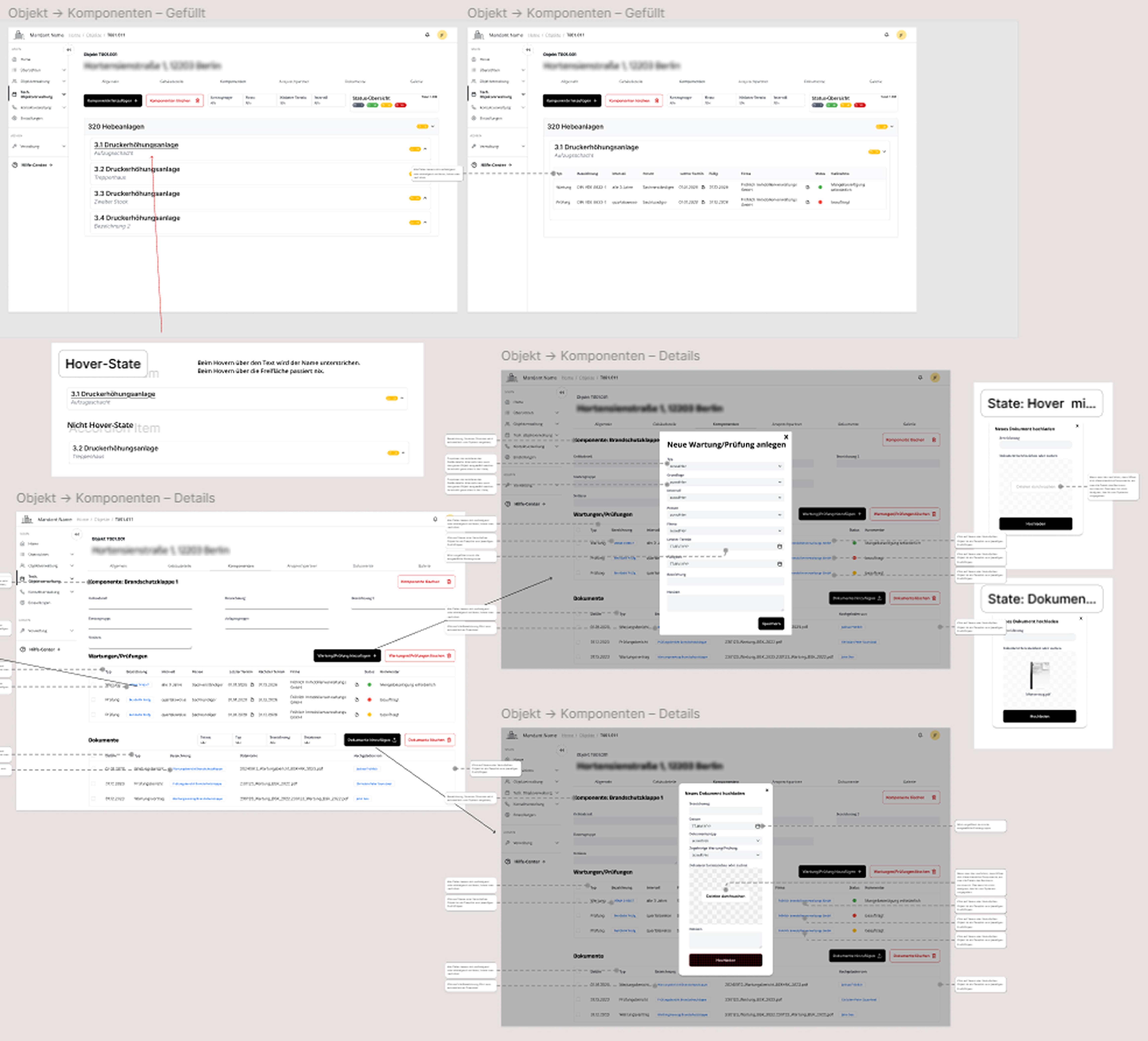
When I joined the project, the Figma file was cluttered with arrows and small comments, making it hard to focus on one thing at a time. I organized and standardized the file using simple tables with clear and concise labels, so developers and future designers can easily find and update content.
Figma file before
Figma file after
Simple & effective documentation
To save time, I skipped complex documentation platforms and created simple Figma tables. Each table documented a component’s properties, states, and interactions, making design rules clear for everyone, ensuring consistency, and reducing mistakes.

Working together: From design to delivery
Throughout the project, I collaborated closely with the main developer and project manager on design delivery and responsive layouts, meeting in person and remotely to ensure smooth implementation and alignment on the design system.
The branding
Translating brand identity into a professional & intuitive interface
Partnering to shape a unified brand experience
I worked remotely and in-person with the branding team on color palettes and typography, brainstorming, researching, and sharing UI best practices to translate brand identity into the interface.
Together, we developed a serious and modern UI that moved away from the outdated and mismatched aesthetic of the original design. By avoiding rigid squares and fully rounded borders, choosing a 4px radius instead, and adding touches of brand colors over warm grey tones, we found a balance between professionalism and approachability, without making the interface feel overly playful.

Designing for effortless interaction
With the design system in place, the product’s visual language came together, ensuring consistent application of brand elements across the platform. These visual patterns make the interface feel familiar and intuitive, so users can quickly recognize components and navigate the platform efficiently - "working without thinking".
Next steps
From MVP to market growth: shaping the next steps
Once all screens are redesigned, the next important step for Vouhn would be to offer a lightweight mobile and tablet version for on-premise users. Since these users have limited access to the software, the interface should stay simple and focused, giving them only the essential features they need when inspecting a property, like quickly adding documents, photos, and reports.
Another key step is to extend the branding from visuals to writing. I strongly believe that UX writing is an integral part of both the brand and a polished user experience, so it’s important to invest in it. Aligning the copy with the brand ensures tone consistency and applying it across the platform can enhance usability, particularly by creating a clear and intuitive onboarding experience.
Reflections on process, challenges, and growth
Insights gained from designing at scale for the first time
First timers - Gaining experience as a junior designer
Working at this scale for the first time felt exciting and overwhelming at the same time. Perfectionism sometimes slowed me down, but I knew that once the design system was complete, the rest of the process would be faster, and I was proven right. Over time, I gained confidence presenting my designs and collaborating with the team, and weekly reflections helped me identify challenges and iterate on solutions.
Communication challenges
There were times when unclear expectations slowed progress, like using icons from multiple libraries without the documentation the developer team needed. I learned to be proactive, ask questions, and suggest ways to improve collaboration, including regular check-ins, in-person meetings, and shared resources.
